User Research, UX Design, UI Design, Copywriting, Pitching
Theia Tracking Dashboard.
The camera-based solution for crowd tracking is aimed at museums that want to stay relevant for today's audience, but struggle to see an exhibition from their perspective and know which exhibits are considered interesting and which are not so much. Theia was developed in cooperation with the Augsburg museums and art collections. As one of two UX/UI Designers on a student team of 6, I worked on user research and interface design for the dashboard.
Problem
Camera-based crowd tracking could provide the Augsburg museums and art collections with reliable real-time data and analysis of visitor crowds on site. Thus, it could help curators and museum directors manage visitor crowds, get feedback about where in an exhibition people visit more and where less, or find out which exhibits are interesting to visitors and which less so. Together with the wonderful Sharon Pinkoss, I was in charge of the UX process for the crowd tracking project. We set out to design the Theia dashboard UI to make it useful and user-friendly. In order to better understand the problem space of the target audience, we conducted user interviews with directors and curators of the Augsburg museums and art collections.
We asked about the challenges museums face in their everyday business, about how they collect feedback from their visitors and if and why they feel the need to look closer at visitors' behaviour in an exhibition. We explored what information from visitor tracking they would want to know and why. We also learnt where museum staff see opportunities and threats in tracking visitors' behaviour. Through the interviews, we also tried to gauge the tech savviness of museum staff.
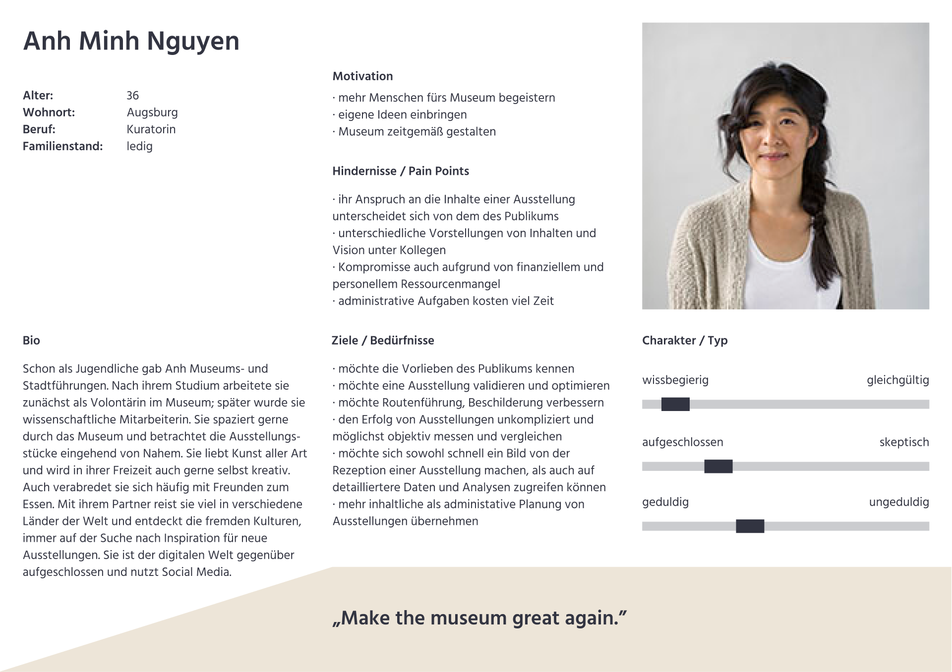
From what we learned, we put together the curator and museum director personas and user stories. These served as a means to evaluate the product stages against users' needs throughout the design and development process.
As a curator...
I want to track which exhibits visitors view/do not view, so that I can take visitors' preferences into account when planning an exhibition.
I want to trace the paths visitors take in an exhibition, so that I can optimize visitor management.
I want to obtain reliable data and analysis of visitor behavior (more reliable than manual counting, observations of guards and feedback from colleagues), so that I can develop more meaningful indicators for the success of an exhibition.
I want to view the data and analyses on visitor behavior in a meaningful and appealing way, so that I can get a picture of the reception of an exhibition as easily as possible and also apply the insights gained to future exhibitions.
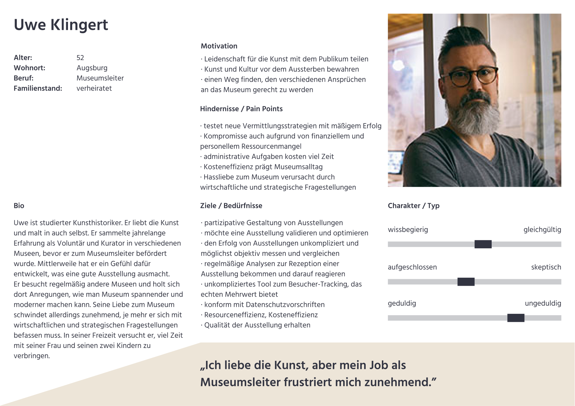
As a museum director...
I want to use visitor tracking to test various strategies of art and cultural education in an exhibition, so that I can make museums more participatory.
I want to obtain reliable visitor numbers for an exhibition, so that I can better assess the success of the exhibition (compared to another one).
I want to receive reliable visitor numbers (in real time), so that I can manage visitor flows better.
I want to receive reliable data and analyses of visitor behavior (more reliable than having people count and observe visitors), so that I can develop more meaningful indicators for the success of an exhibition.
I want to use a method of visitor tracking that doesn't affect the exhibits, so that I can preserve them for future generations.
I want to use an unobstrusive and data protection compliant method of visitor tracking, so that I don't disturb the museum visitors or prevent them from visiting again.
Process
The goal of the project was to run a prototype consisting of visitor tracking via camera image recognition and a user-friendly data visualization on a dashboard for two rooms of an Augsburg museum. According to the UX process, to understand the needs of museum directors and curators, we created the personas and wrote the user stories.
We then also mapped out a user journey to make sure to provide a meaningful and relevant experience at all important touchpoints with the dashboard. We made Low-Fi prototypes of the Theia tracking dashboard to figure out its content and structure before we moved on to the Hi-Fi prototype. We usability tested our prototypes to find out if they are viable and usable for the museum directors and curators and where there are problems to be solved.
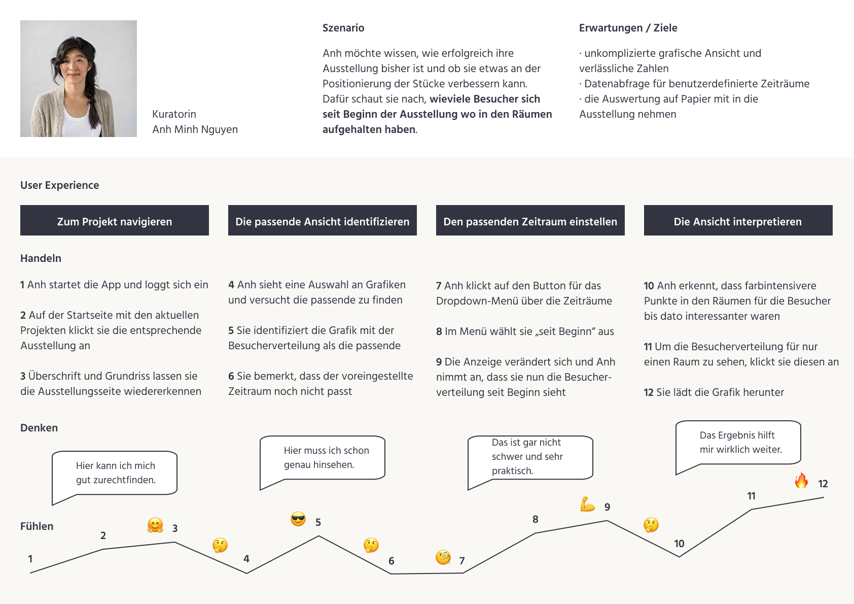
1. User journey
A curator wants to know how successful their exhibition is so far and if they could improve the positioning of exhibits. So they look up how many visitors have walked where in the rooms since the beginning of the exhibition. They expect easy-to-read charts and reliable numbers, options for the time period displayed, and the possibility to print out the information from the dashboard.
Using the application, the curator goes through four major steps: 1. Navigate to the project (exhibition), 2. Identify the relevant view (chart), 3. Set the time period as needed and 4. Interpret the chart.
2. Low-Fi prototype
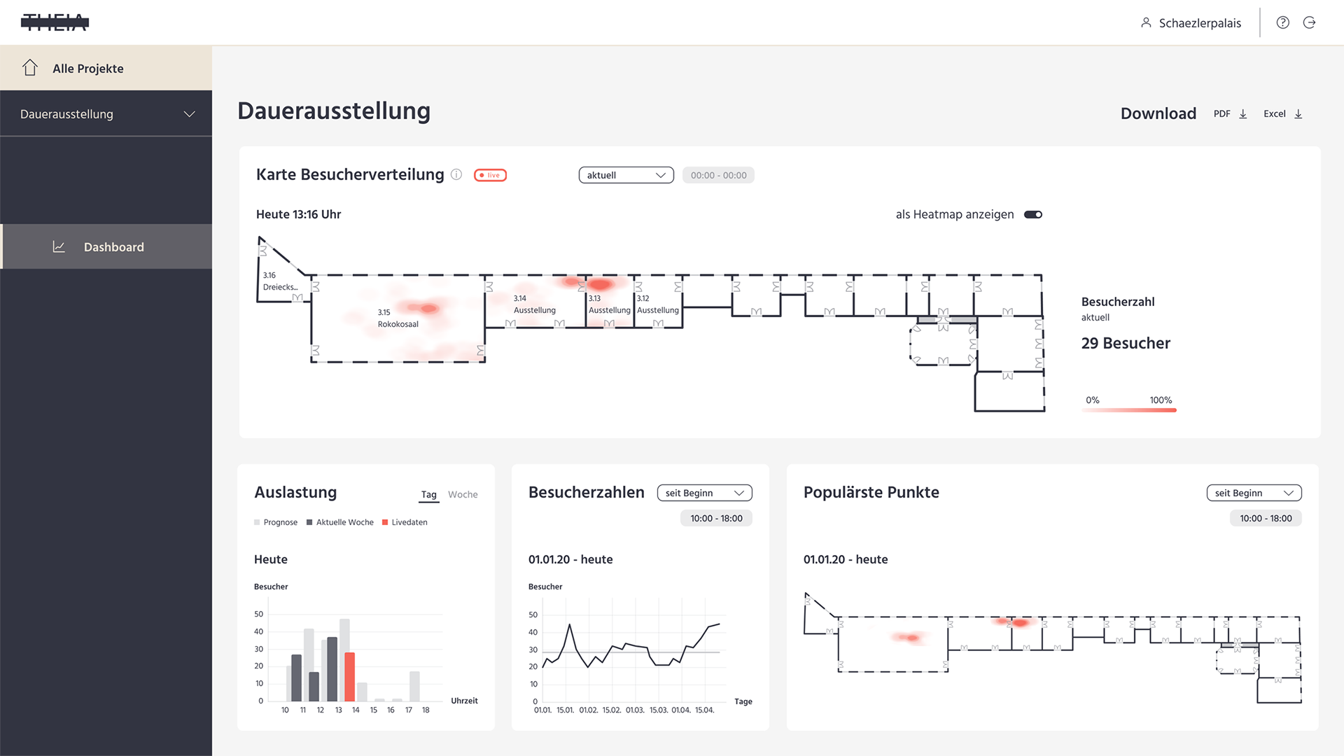
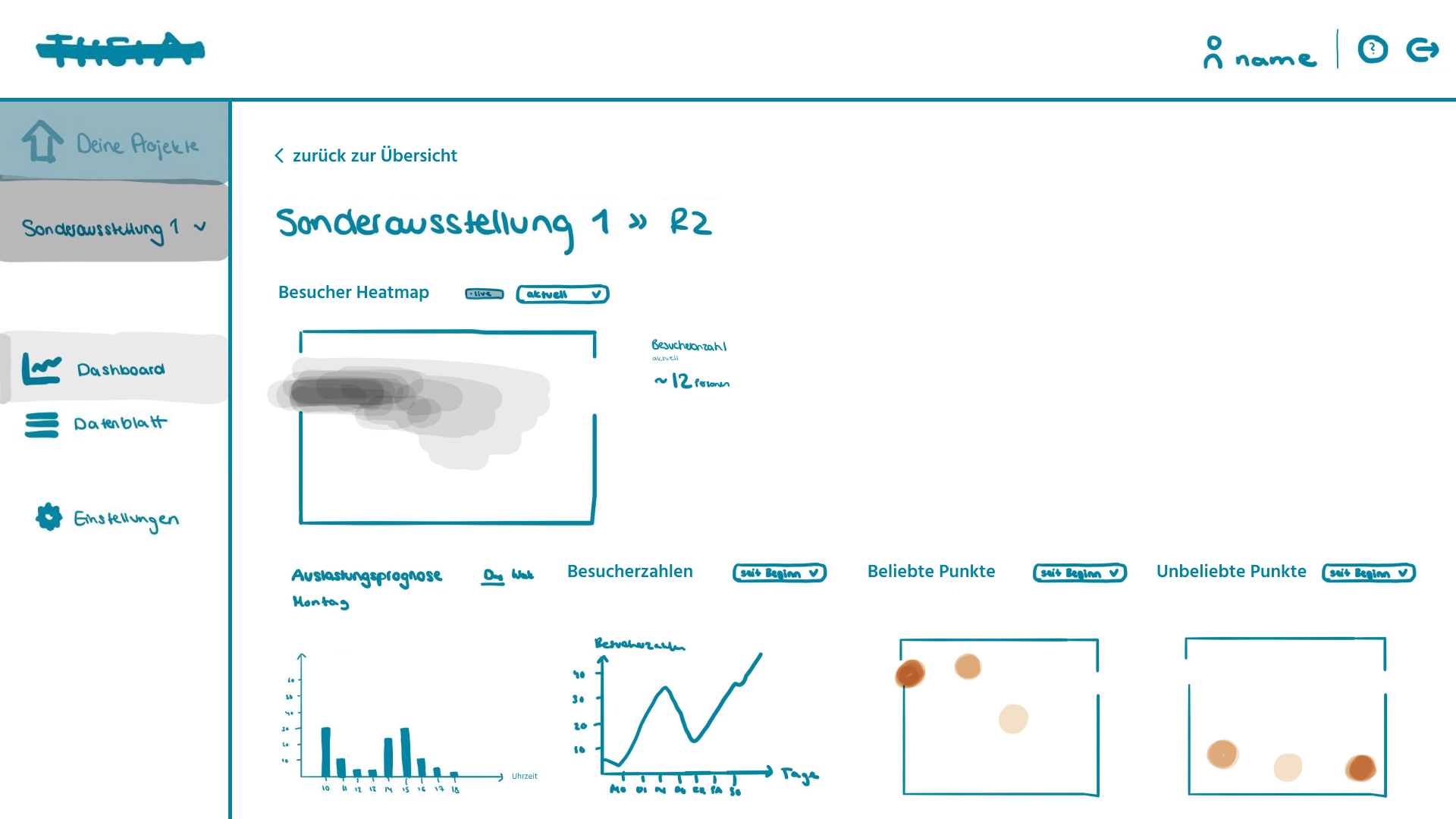
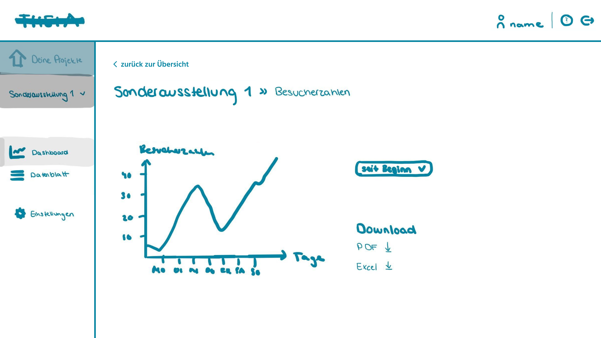
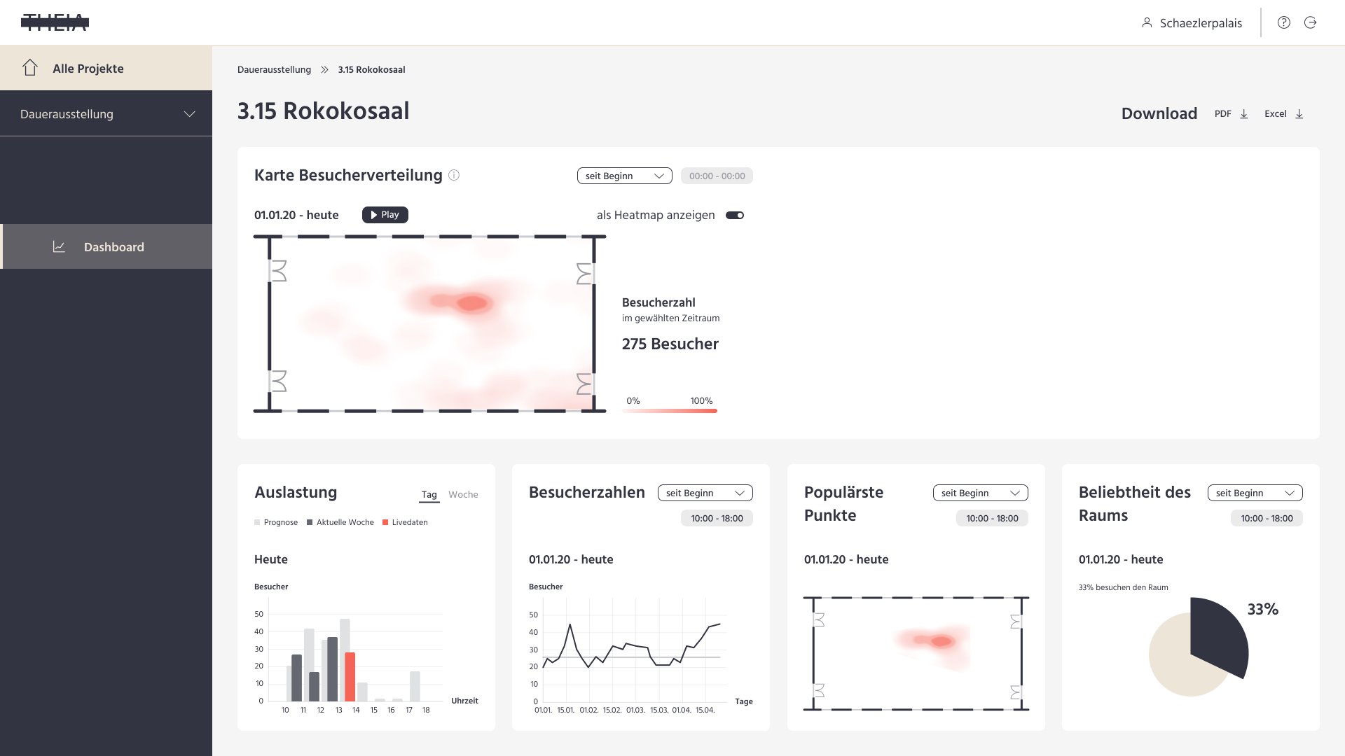
On the dashboard of an exhibition, users can view the collected quantitative data in different graphical representations. There are analyses from the crowd tracking for the whole exhibition, as well as for individual rooms. The main chart is a map of the visitor distribution in the exhibition or room. By default, it is set to a live view, but there is a dropdown menu and integrated calendar to choose from different time periods. Users can navigate to the dashboard view for an individual room by clicking the room on the map.
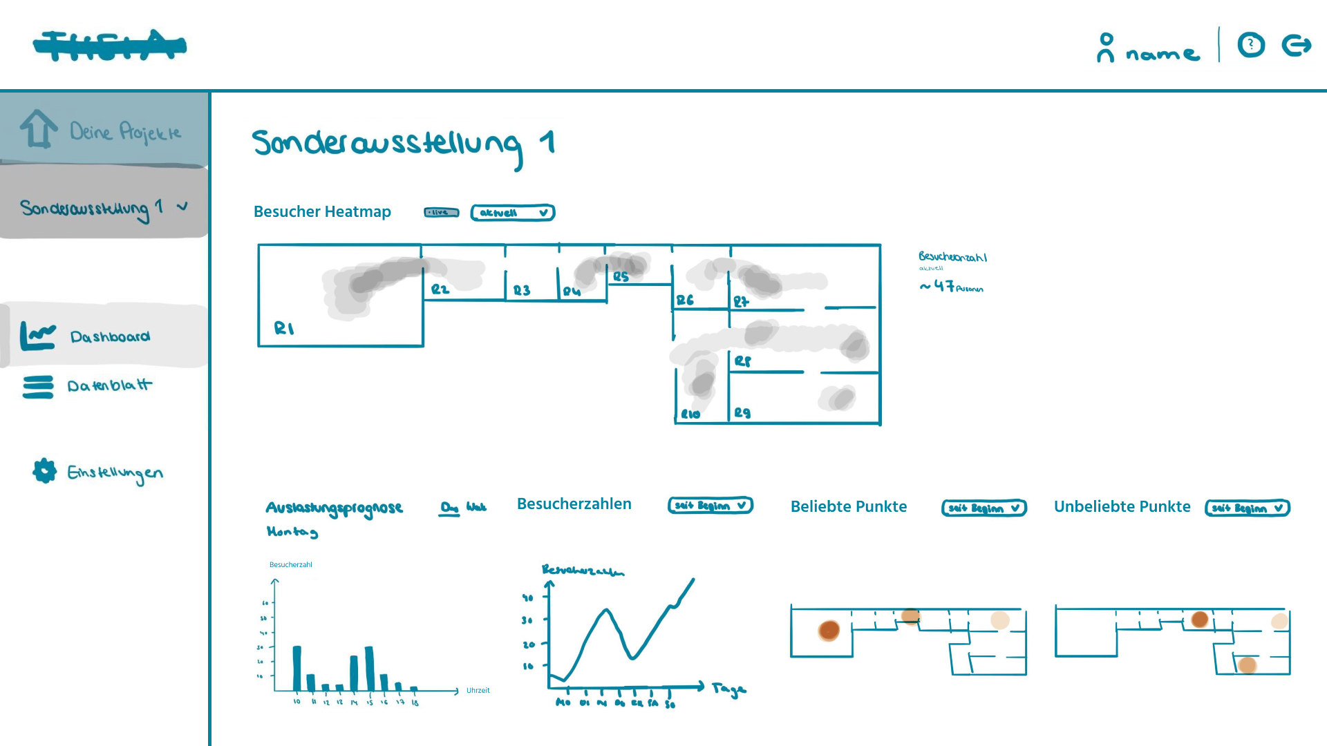
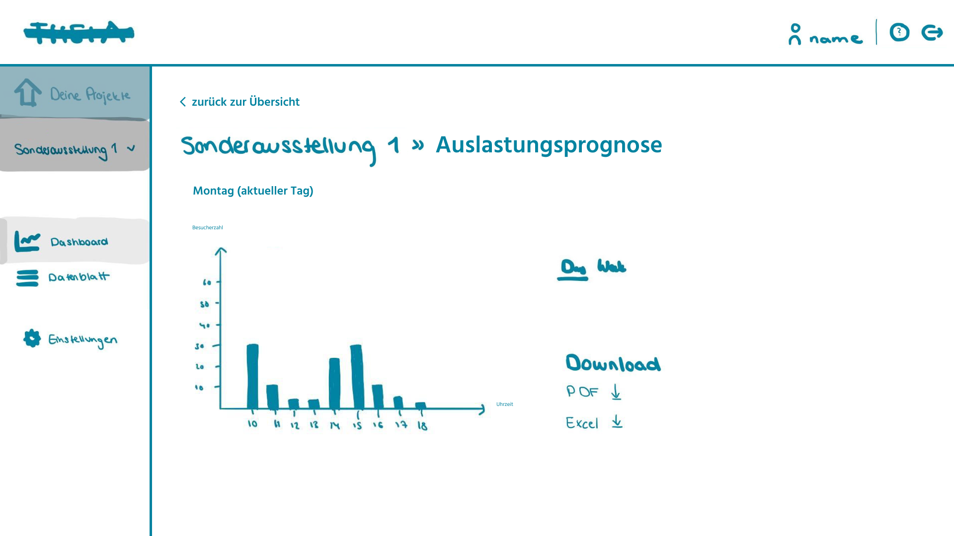
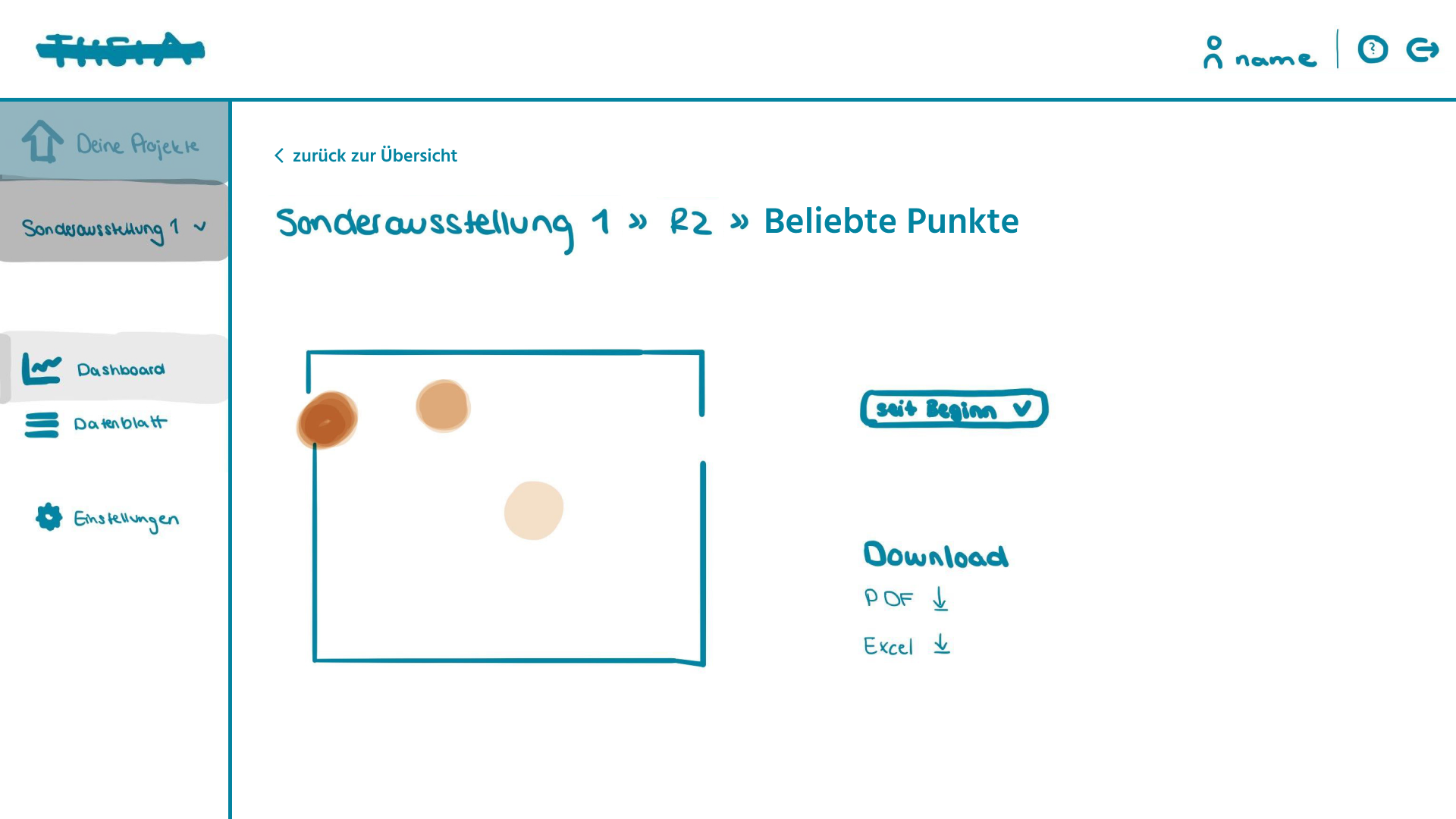
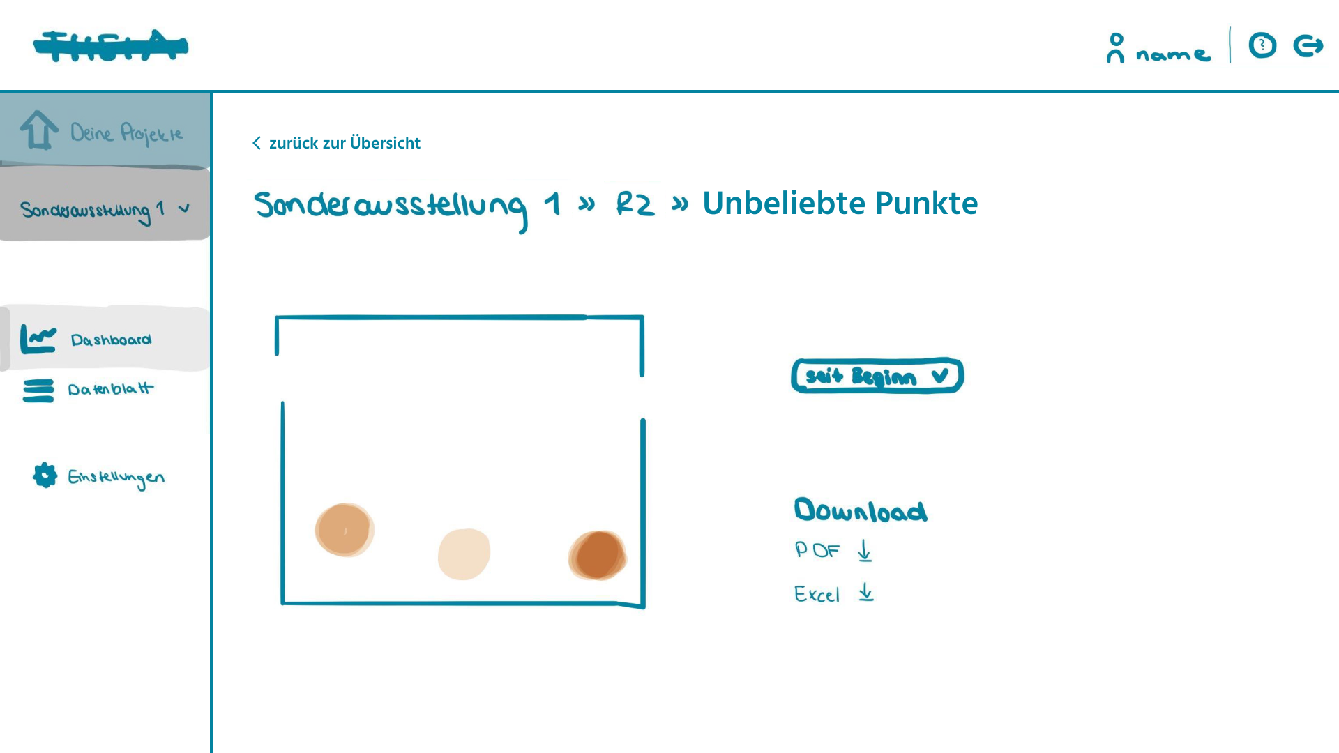
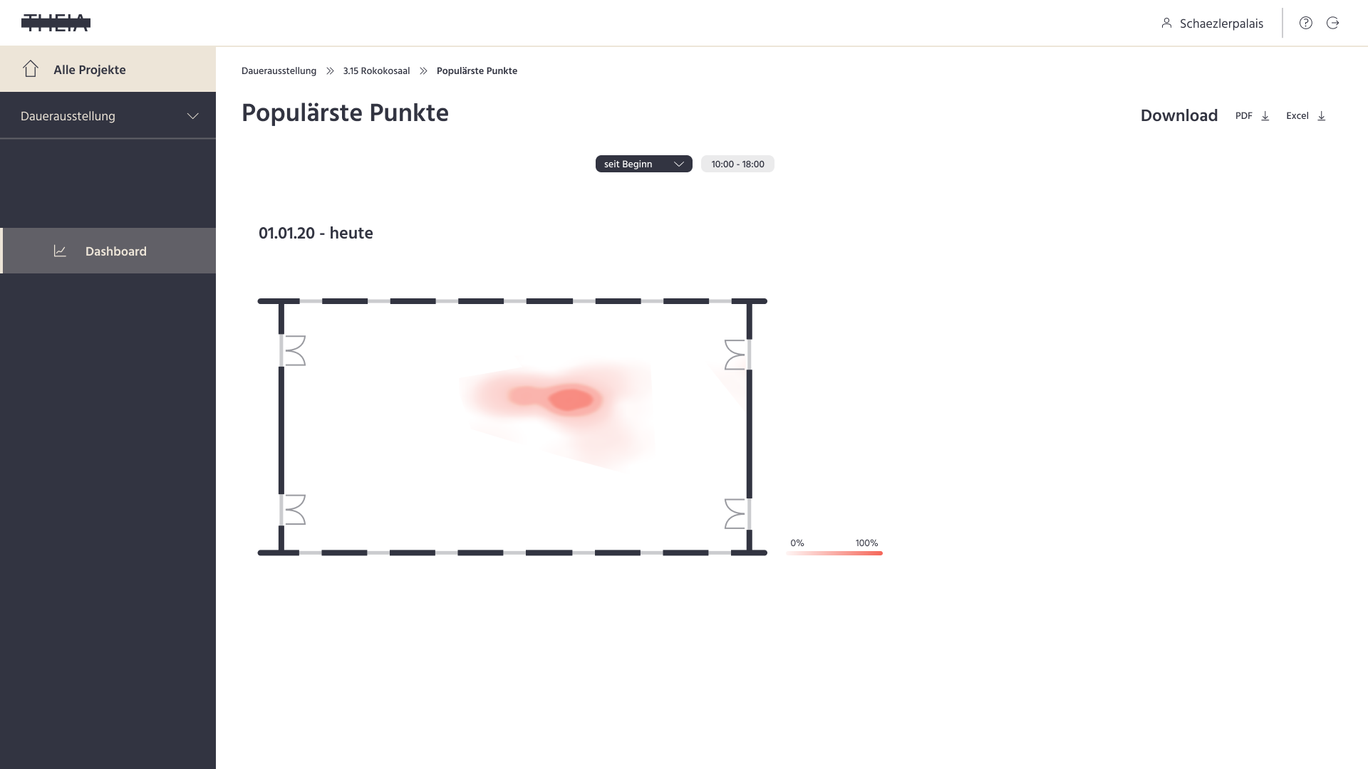
Below the map, users can find several additional charts. The occupancy bar chart represents how busy the exhibition or room is at the current time or day compared to the average from past data and a prediction. A line chart shows the visitor numbers of the exhibition or room and can be set to different time periods as well. The most/least popular points in the corresponding charts are calculated from the accumulated visitor distribution for the period selected. Clicking a chart takes users to a seperate page with a larger representation, where they can also download the chart or data.
Solution
We built and adjusted our Low-Fi and Hi-Fi prototypes of the Theia tracking dashboard according to what we learnt through testing them with curators and museum directors, thus making the user interface fit their needs. Usability testing helped us to determine which features museum staff needed or could do without, and to uncover any problems with the navigation in the application or with the understandability of the content. Ultimately, users should be able to interact intuitively with the application, easily get to the information they need and read it correctly from the charts provided.
The Theia solution includes the Hi-Fi prototype of the dashboard, but also the camera-based crowd tracking technology (not part of my work).
1. Hi-Fi Prototype
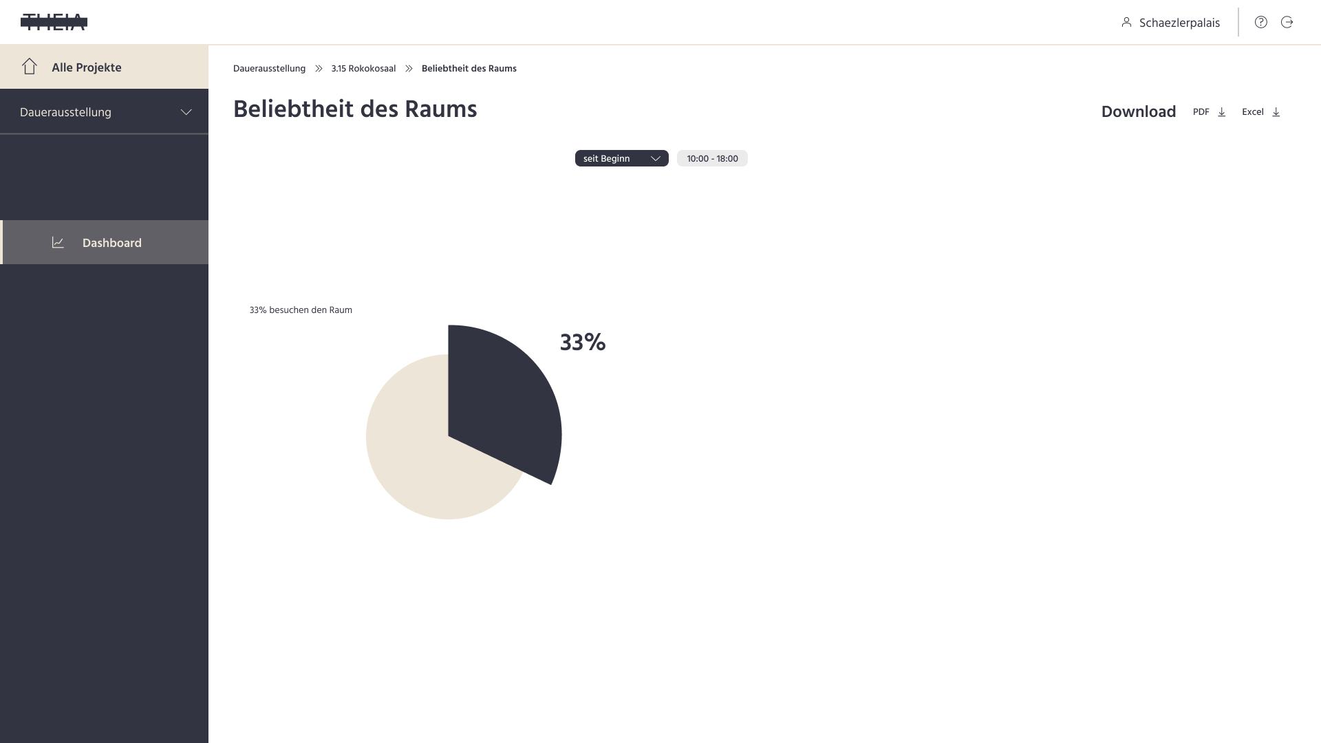
The Hi-Fi prototype includes the prominent visitor distribution map, and the charts of occupancy, visitor numbers and most popular points, as well as the corresponding sub-pages. We decided to get rid of the representation of the least popular points, as they might not relate to the exhibits at all and might not provide meaningful insights.
However, when users navigate to the dashboard view for an individual room, there is instead a representation of the popularity of the room. From this chart, they can learn how popular the room is in relation to the total visitor number for the selected period.

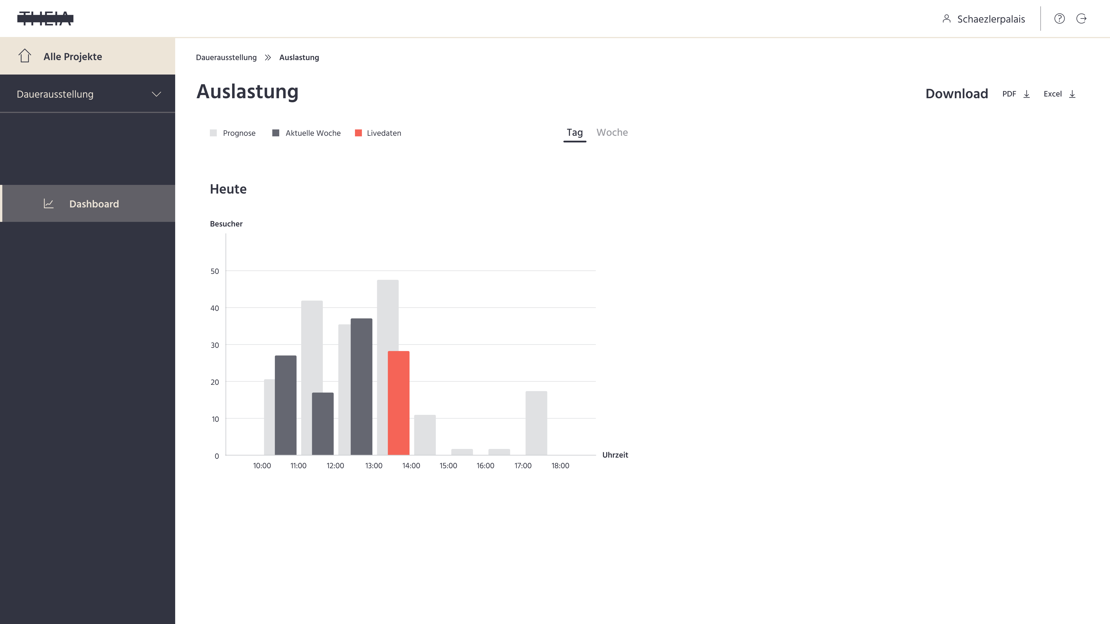
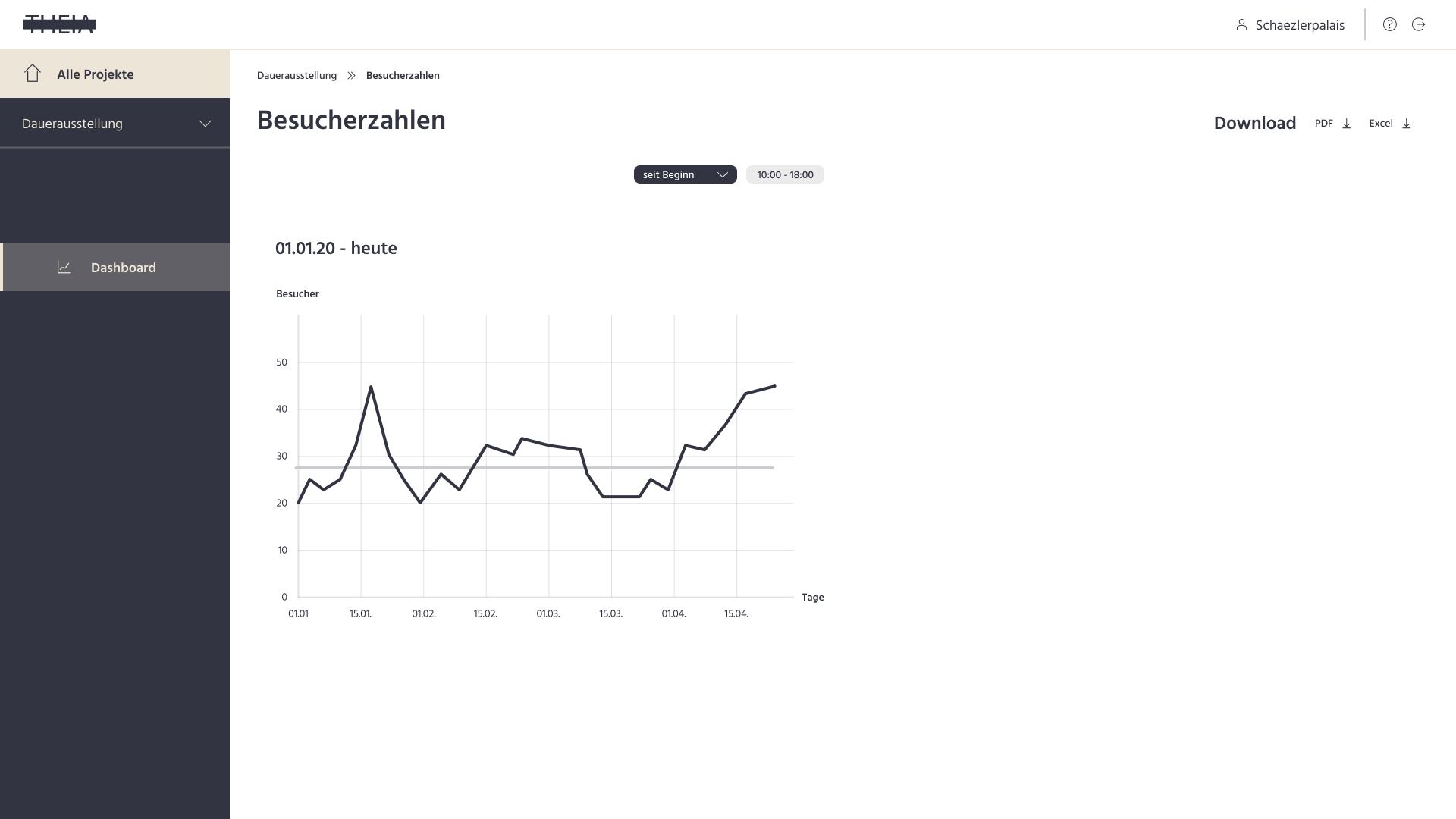
On the Theia dashboard, the map of the visitor distribution by default is set to a live view. When users select a different time period for display, e. g. since beginning, they get to see the accumulated data for the selected period. They can also hit the play button above the map to watch the visitor distribution over time in a time-lapse. While the visitor distribution is played back, a progress bar and controls to pause and stop are displayed.

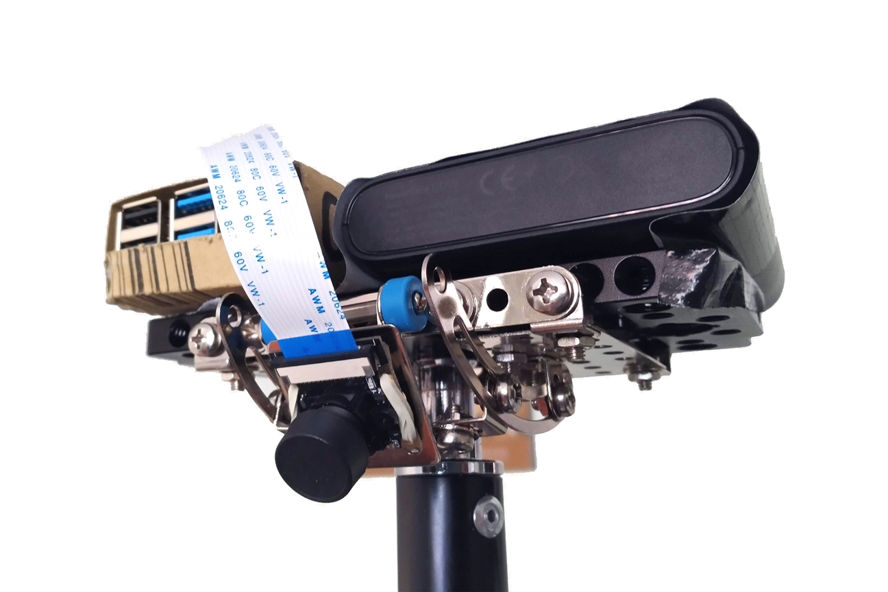
2. Tech (others were responsible)
The crowd tracking system behind the Theia dashboard records and processes visitor numbers, location and movement data in real time. In every room of the exhibition, a Raspberry Pi with a 160° camera module takes pictures in one second intervals. The camera images are processed using machine learning. First, the system detects a person in an individual image and determines the location of their feet. Then, a specially developed algorithm is used to analyze several consecutive images and correct the location of the detected person accordingly. Finally, the location of the visitors in the room are calculated as accurately as possible.
Team
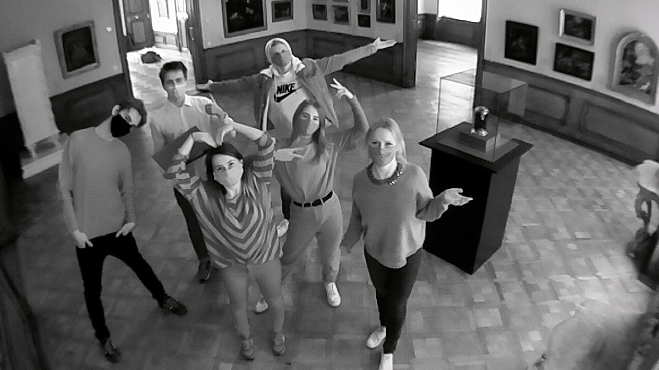
Here is a picture of the lovely team I worked with on the Theia project. The picture was taken in an Augsburg museum with our camera setup for crowd tracking. In total our student team counted two developers and four designers. The two UX/UI Designers, Sharon Pinkoss and me, are on the right side of the picture.